Spring Cleaning: Updating The Blog
Ahhhh, it's the beginning of March which means only 15 more days until it is officially spring. (Which means it will also be my second blogiversary too!) In light of the change in season, I am sure many of you are like me and this means some heavy duty spring cleaning is about to take place! And though it is not spring quite yet, I have been doing some early spring cleaning of the cyber variety.
As I am sure some of you may have noticed, my blog looks slightly different than it used to, and that is because I decided, since my whole living space is getting a revamp, my blog might as well too (I mean I spend enough of my time on here, right?)! And though nothing too crazy has changed here, I just added some easier navigation features which gives my navigation bar a sleeker, less cluttered look, as well as some coding and copyright updates. But I figured why not walk through my changes with you all and explain some of the choices I made. I also figured this post would be a good precursor for the other three spring cleaning posts I have planned for this year. (Recall the room revamp that I mentioned earlier this week? Yep, it's going to be a three part post once everything is finished and organized to my liking!) So without any further to do, here are the changes I have made:
1. No more "What's In My..." Section
Yes, I know, the "What's In My..." section was a reader favorite, however, I just did not see the point in keeping it any longer, and here is why: You see, when I first started my Stark Raving Chic on March 20, 2015, I originally started it as a hobby and intended to only do style based posts such as "outfit of the day" posts along with a couple beauty articles here and there. Really, I just started my blog for something fun to do, and since I was solely focusing on fashion and beauty at that time, I thought the "What's In My..." page was a cute touch. However, my blog has flourished so much since then (Like really, really, flourished from my very first post, which was a simple lip balm review.) that I have now branched out into many different genres of blogging, ranging from lifestyle/travel, charity events, and even occasional blogging tip articles. So, needless to say, I am no longer solely a style blogger, but a jack of all trades, which is why I decided a "Categories" menu would be more fitting.
Aside from no longer concentrating only on style and beauty, I also felt that adding a simple categories menu gave my blog a more "grown-up" feel than the one it had when I first started it as a 21 year old undergrad (and considering I am now on track to get my masters, I'm feeling awfully grown up). I felt that this decision made my blog look much less cluttered as well as making it more organized and ultimately easier for my readers to navigate. And though I'm sure the "Categories" menu speaks for itself, I did want to point out that I did in fact keep my "Look Book" page which was formerly a part of the "What's In My..." section, just so my readers could have easy access to photos of my past outfits. Which leads me to a new feature that I added because I felt it would be helpful to my readers, and that feature is an archive!
From Personal Style 2017
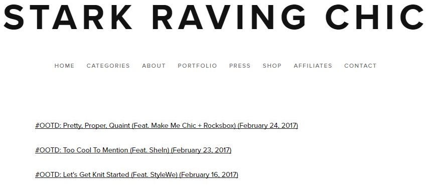
The reason I felt an archive of my posts would be beneficial is because while organizing my categories menu, I realized I have a ton of posts, so if someone wanted to find something even from a month ago, they could be paging through one category forever. So, for my archive, I decided to split it up by year and category. And as you can see in the example photos above, you simply just pick the year, then the category, and you are then directed to a complete index of your selected category which includes the post titles and dates, along with links to the specific articles.
2. No More "Badges" Page
So even though this isn't a huge change and all of my badges are still on here, I just figured I would point out where they are now and what I changed the name to. You see, all the badges I have acquired are due to all of the blogging communities that I am a member of, and urge other bloggers to join. Each of these communities are a great way to build your following and many of the people within them are super nice and helpful! With that being said, I just wanted to let everyone know that now my badges are now simply listed under my "Contact" menu as "Blogging Communities". And as I stated earlier, I am a member of each of them so feel free to sign up and reach out!
3. "LIKEtoKNOW.it" is now just "Shop"
In case you haven't heard, I am now part of rewardStyle and am one of their Instagram influencers on the site LIKEtoKNOW.it. That means my readers can shop my outfits, beauty products, and decor straight from my Instagram feed, and all you need to do is go to my "Shop" page and click whatever photos in my feed interest you. And much like my "Blogging Communities" page, this shop will open in a new tab so you don't lose your place on whatever you were reading!
4. Updated Coding
Due to actually having my current photography portfolio on here as well as my other work, I decided it would be best to have some coding that would not allow people to plagiarize my work. Okay sure, this does not prevent individuals from taking screenshots of my images and text, however it does prevent individuals from all of the following:
- Right clicking to save images and right clicking to copy/paste.
- Dragging and dropping to save images.
- Highlighting text to copy/paste.
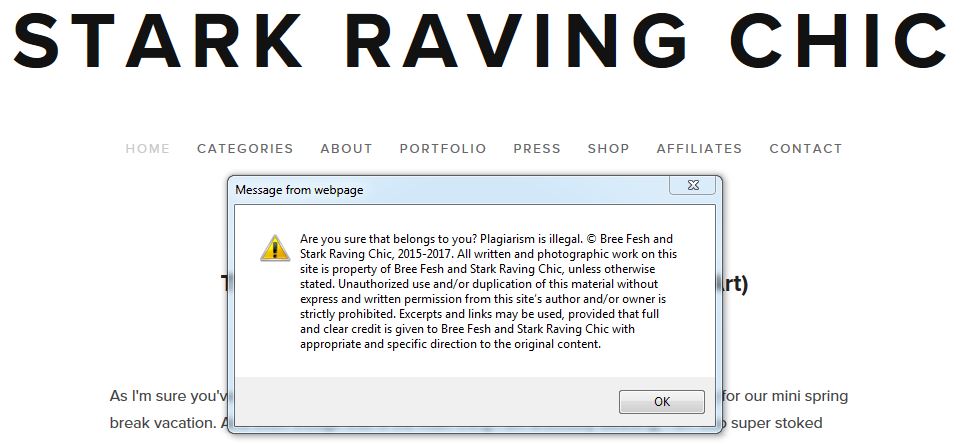
I also have it set up that if some one does attempt to steal my work, a pop up message (pictured above) with my copyright notice appears. Pretty nifty, am I right? (Also note, if you would like any of this coding just email me and I'll send it your way!)
5. New Copyright Statement + DMCA Certificate
To follow up my new preventive coding, another thing you may have noticed is that I now have a copyright statement at the bottom of my blog. Many of you are probably wondering why I want this big clunky legal thing in my footer, and truth is I honestly don't. However, due to the notoriety my blog has gained in the past two years, I was advised that it would be best to fully protect my work, and along with working with the DMCA, a copyright statement is a good thing to have. Which leads me to my next point:
If you do (and you should) choose to put a copyright statement on your blog or website, it is important to have a well written, full coverage, copyright statement. The reason I say "full coverage" is for example, if my copyright only said "© Bree Fesh and Stark Raving Chic 2017" that makes any articles on my blog prior to 2017 vulnerable to theft, even under certain copyright laws. Where having the full "© Bree Fesh and Stark Raving Chic 2015-2017" prevents this, due to the fact it includes all the dates that I have published work.
So I mentioned the DMCA earlier and you're probably wondering what that is. Though I will be covering this topic again in my upcoming blogiversary post, I cannot stress enough how important it is to protect and copyright your work, especially if it is online. With that being said, I am proud to announce that Start Raving Chic is 100% protected by the Digital Millennium Copyright Act. And though I will discuss it more in my post on March 20th, I just want to point out that the DMCA only cost $10/month and guarantees that if someone steals your work and tries to claim it as their own, and/or makes defamatory statements about you online, the DMCA will investigate and have the stolen or defamatory material taken down.
6. New Branding
And lastly, while we are talking about very important things to have on your blog or website, I wanted to take a minute to talk about branding, and share with you my new addition of it to my blog! Though I have had my business cards and logo for some time now, as well as incorporating my logo on my Facebook page and Twitter, I hadn't included my logo anywhere on my actual blog. So, now I do I not only have my logo in the footer of my blog's pages (which if you click on it, it will take you right back to my home page!) but Stark Raving Chic also has it's very own favicon now! And in case you don't know what a favicon is, it's simply just the little icon next to my URL that is displayed in your address bar. I know, it's super dorky, but I'm totally stoked about it. And the reason I am so excited about it is because by placing my logo in these two places, it gives the public one specific image to associate my blog with, therefore making my brand even stronger and gaining it even more recognition.
So even though these changes were rather minor, and my blog still has its original chic, minimalistic look, I felt many of the changes were worth sharing with you guys to hear some thoughts and feed back, so fire away!
Also, what are some of the things you are updating and revamping this spring? Let's chat about it in the comments below, or you can tweet me at @StartRavingChic! Later, babes!
Xx, Bree


